Statistics Assignment: How Statistical Techniques Can Solve Business Problems?
Question
Task:
Write a statistics assignment addressing the following questions:
Question 1
The higher education department of Holmes Institute recorded data on the number of students enrolled in the different study majors for the years 2018 and 2019.
- Use an appropriate graphical technique or chart to compare the number of enrolment in 2018 and 2019 of the different study major. Display the chart.
- Use an appropriate graphical technique or chart to display the percentage value of the number of enrolment of the different study major in 2018 and 2019. Display the chart.
Note: Questions 2 to 6 are related.
Question 2
Sociologists argued that women on average earn less than men as women often choose to work less hours. They further suggest that the choice of hours worked may be driven by various factors such as age, childcare needs, occupation choice and flexibility. To investigate the relation between hours worked and income earned by Australian men and women, a researcher plans to survey a sample of individuals across the country. Briefly explain (using no more than 250 words in total for this question)
- What type of survey method the researcher could use and why?
- What sampling method could the researcher use to select his/her sample and why?
- What are the two main variables the researcher should consider collecting data for the purpose of the above analysis and why? Identify the data type(s) for the variables.
- What kind of issues the researcher may face in this data collection?
Suppose a researcher has collected data from a sample of 65 individuals using the sampling method you have proposed in (b). For each individual, the hours worked per week and yearly income (measured in ‘000’s dollars) were recorded.
Question 3
First, the researcher categorised the data into six location groups and six occupation groups, and calculated the frequencies given below.

Using the data in the frequency tables above answer the following questions.
- Which graphical technique or chart should be used if the researcher is interested in comparing the number of individuals in each location group? Explain the reason for the selection of this graphical chart. Construct and display the chart, also briefly describe what you can observe about the number of individuals belonging to each location category.
- Which graphical technique or chart should be used if the researcher is interested in comparing the proportion of the number of individuals in each occupation group? Explain the reason for the selection of this graphical chart. Construct and display the chart, also briefly describe what you can observe about the proportion of the number of individuals belonging to each occupation category.
Question 4
Second, the researcher wishes to use graphical descriptive methods to present summaries of the data on each of the two variables: hours worked per week and yearly income,
- The number of observations (n) is 65 individuals. The researcher suggests using 7 class intervals to construct a histogram for each variable. Explain how the researcher would have decided on the number of class intervals (K) as 7.
- The researcher suggests using class intervals as 10 < X ? 15, 15 < X ? 20, …, 40 < X ? 45 for the hours per week variable and class intervals 40 < X ? 45, 45 < X ? 50, ..., 70 < X ? 75 for the yearly income variable. Explain how the researcher would have decided the width of the above class intervals (or class width).
- Draw and display a histogram for each of the two variables using appropriate BIN values from part (b) and comment on the shape of the two distributions.
Question 5
Third, the researcher wishes to use numerical descriptive measures to summarize the data on each of the two variables: hours worked per week and yearly income.
- Prepare and display a numerical summary report for each of the two variables including summary measures such as mean, median, range, variance, standard deviation, smallest and largest values and the three quartiles.
- Compute the correlation coefficient using the relevant Excel function to measure the direction and strength of the linear relationship between the two variables. Display and interpret the correlation value.
Question 6
Finally, the researcher considers using regression analysis to establish a linear relationship between the two variables – hours worked per week and yearly income.
- What is the dependent variable and independent variable for this analysis? Why?
- Use an appropriate plot to investigate the relationship between the two variables. Display the plot. On the same plot, fit a linear trend line including the equation and the coefficient of determination R2 .
- Estimate a simple linear regression model and present the estimated linear equation. Display the regression summary table and interpret the intercept and slope coefficient estimates of the linear model.
- Display and interpret the value of the coefficient of determination, R-squared (R2 ).
Answer
Statistics Assignment Question 1
- Chart: Comparison of enrolments in 2018 and 2019
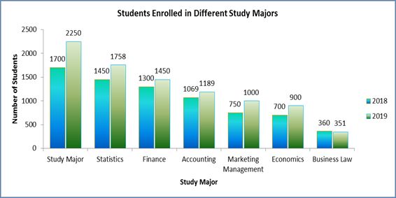
Figure 1: Student Enrollment Comparison between 2018 and 2019
- Chart: Comparison of percentage enrolments in 2018 and 2019
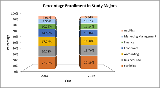
Figure 2: Percentage Student Enrollment Evaluation concerning 2018 and 2019
Question 2
- Survey Method: Personal information was to be collected from participants regarding their income, age, occupation choice, childcare needs, and flexibility. Hence, the best way of survey was In-person interviews to assess the participants and their facial expressions or discomfort regarding answering the questions(Johnson, Scheitle, and Ecklund, 2019, p.0894439319893612). That way collected responses could have been more reliable.
- Sampling method: The objective of the research was to compare earnings of men and women and to find the underlined possible causes of women earning less than men on average. Hence, stratified sampling was the appropriate choice for choosing considerable or equal representatives from both the genders(Robinson, 2014, pp.25-41). This type of sampling would have reduced the sampling bias. Simple random sampling also can be administered after the stratums are chosen to select men and women arbitrary from the respective stratums.
- Main variables: Choice of primary variables depends on the objective of the research. In case, the primary objective was to assess the linear relation between income and duration of work of Australians, two variables that were the most important were “Income per week/ month or year” and “Hours worked per week/ month/ year”. But, if the researcher wanted to compare income of men and women, “gender” and “Income per week/ month or year” were the two most important variables.
Data Type: “Income per week/ month or year” and “Hours worked per week/ month/ year” are quantitative, continuous and ratio scale data. Gender is a nominal variable with two categories.
- Challenges of data collection: Due to lack of mutual trust participants might hide their actual income and even hesitate to tell their exact working hours. Some interviewees might have cognitive restrictions(Rahman, 2015. pp.10-13). Also, time and cost would have been the two major issues in the collecting the primary data. At last, achieving higher validity and reliability of the acquired data would be the two challenging concerns.
Question 3
-
Graphical Technique: Bar chart would be the most appropriate graphical tool to display the location group wise frequency data.
Reason: Bar chart is useful and suitable to present and visually compare categorical data. The frequency of the six distinct locations was a categorical and nominal data. Therefore, Bar chart was chosen correctly to represent the frequency distribution data.
Observation:The bar chart in Figure 3 displays the location wise frequency data. It was noted that most of the individuals (N = 25) were located in Group D location. Group C had 12 individuals followed by 10 people in Group C. Group B, F, and A had almost equal sharing of the sample data with 7, 6, and 5 sample data respectively.
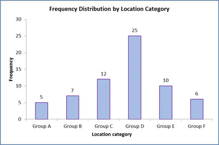
Figure 3: Frequency Distribution by Location Category of Individuals
-
Graphical Technique: Pie chart would be the most appropriate graphical tool to display the occupation group wise proportion frequency data(Savva et al. 2011, pp. 393-402).
Reason: Pie chart is useful and suitable to present and visually compare percentage or proportion data where the total is 100%. The proportion frequency represented in percentage in the graph of the six distinct occupations was a categorical and nominal data. Therefore, Pie chart was chosen correctly to represent the proportion frequency distribution data.
Observation: The Pie chart in Figure 4 displays the occupation wise proportion or percentage representation from the entire sample data. It was noted that maximum of the individuals (40%) were fromthe second occupation group, followed by 23% individuals working in the third group, whereas18% individuals working in group 4. Rest of the 19% people worked in occupation group 5 (8%), group 1(6%), and group 6 (5%) respectively.
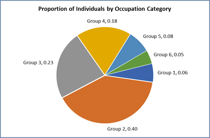
Figure 4: Proportions of Individual Representation from Occupation Categories
Question 4
- Choice of number of classes is a trial an error method that selects between 6 to 15 classes, where the researcher ensures that sufficient number of observations is present in each class (minimum 5 observations is always great)(Zhukov and Popov, 2014, pp. 259-263). Here, by the choice of 7 classes the class width of “Hours per Week” and “Yearly Income ('000's)” becomes near to 5 units. This class width ensures sufficient data in each class for both the variables. Again, from the 2k> n rule (k = number of classes, n = total observations) it can be noted that 7 is the least integer where 27> 65. Hence, the researcher has chosen the number of classes in line to the theory.
- Width of the class is evaluated by dividing the difference between the maximum and minimum value of a variable by the number of selected classes. Maximum and minimum values for hours per week are 44.5 hours and 11.5 hours respectively. Hence, class width for 7 classes is calculated as (44.5 – 11.5) / 7 = 4.7 (correct to one decimal). Hence class width of 5 hours was the nearest integer. So, the selected classes were unquestionably appropriate. Maximum and minimum values for yearly incomeare 74.8 (‘000’s) and 41.2 (‘000’s) respectively. Hence, class width for 7 classes is calculated as (74.8 – 41.2) / 7 = 4.8 (correct to one decimal). Hence class width of 5 (‘000’s) was the nearest integer, and the selected classes were perfectly describing the data.
- Histograms:
Hours worked per week: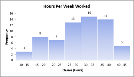
Figure 5: Histogram of Individuals Working Hours per Week
Comment: The histogram seems to have sufficient frequency in almost each class. The shape of the distribution appears to be bell shaped or normal in nature with a slight left skewed shape due presence of 3 individuals working weekly between 10 to 15 hours. The median seems to be located just above 30 hours weekly work.
Yearly Income (‘000’s):
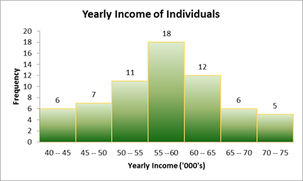
Figure 6: Distribution of Yearly Income of 65 Individuals
Comment: The histogram in Figure 6 reflects sufficient representation or frequency in each class (frequency >= 5). The distribution is noted to be almost perfectly normal in shape with median income located between 55 (‘000’s) and 60 (‘000’s). Both the tails are almost mirror image of each other.
Question 5
- Numerical Summary:
Table 1: Descriptive Summary of Hours per Week and Yearly Income ('000's)
Descriptive
Hours Per Week
Yearly Income ('000's)
Mean
29.87
57.33
Standard Deviation
8.05
8.27
Median
30.5
56.2
Smallest
11.5
41.2
Largest
44.5
74.8
Range
33
33.6
Q1
24.5
51.35
Q2
30.5
56.2
Q3
36.5
63.75
Table 2: Excel formulas used for descriptive summary
Descriptive
Hours Per Week
Yearly Income ('000's)
Mean
=AVERAGE(A2:A66)
=AVERAGE(B2:B66)
Standard Deviation
=STDEV.S(A2:A66)
=STDEV.S(B2:B66)
Median
=MEDIAN(A2:A66)
=MEDIAN(B2:B66)
Smallest
=MIN(A2:A66)
=MIN(B2:B66)
Largest
=MAX(A2:A66)
=MAX(B2:B66)
Range
=F6-F5
=G6-G5
Q1
=QUARTILE.EXC(A2:A66,1)
=QUARTILE.EXC(B2:B66,1)
Q2
=QUARTILE.EXC(A2:A66,2)
=QUARTILE.EXC(B2:B66,2)
Q3
=QUARTILE.EXC(A2:A66,3)
=QUARTILE.EXC(B2:B66,3)
-
Linear correlation between the weekly hours worked per week and yearly income was calculated using Data analysis Tool pack in MS Excel. The linear relation was moderate to high in strength and noted to be in the positive direction.
Table 3: Correlation Coefficient between Hours per Week and Yearly Income ('000's)
Correlation
Hours Per Week
Yearly Income ('000's)
Hours Per Week
1
Yearly Income ('000's)
0.666
1
Interpretation: Yearly income of an individual would increase reasonably for increase in per hour of work per week. Hence, an individual would considerably earn more if he/she works more number of hours in a week.
Question 6
- “Hours per Week” is the independent variable and “Yearly Income ('000's)” is the dependent variable.
Reason: Income of an individual depends on his or her total working hours, ability, and position in the company. Although there exists a positive correlation between the two variables, working hours does not depend on what amount a person earns annually.
- Scatterplot to investigate linear relationship:
Linear trend line is: Yearly Income ('000's) = 0.6843 * Hours per Week + 36.885 Coefficient of Determination: R2 = 0.4435(Zhang, 2017, pp.310-316).
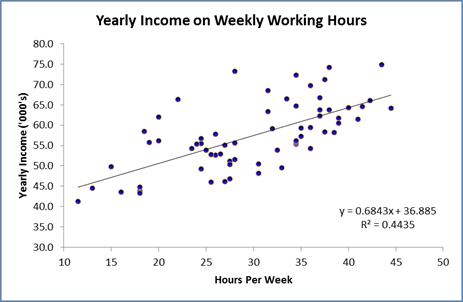
Figure 7: Scatterplot for Relation between “Hours per Week” and “Yearly Income ('000's)”
- Regression Model:
Linear Regression Equation: Yearly Income ('000's) = 0.684 * Hours per Week + 36.885Table 4: Regression Summary Table for “Yearly Income ('000's)” on “Hours per Week”
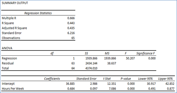
Intercept: Intercept of 36.885 for “Yearly Income ('000's)” implied that for “Hours per Week” = 0, annual income is nearly 36.9 ('000's). Hence, there is 36.9 ('000's) annual income for no weekly work hours. This means that other than weekly work hours, there are other independent factors that affect annual income.
Slope Coefficient: Coeffficnet of 0.684 implied that increase weekly work by one hour would incraese annual income approximately by 0.68 ('000's).
- Coefficient of determination = R2 = 0.443: The value indicated that weekly work hour was able to explain almost 44.3% variation in yearly income of an individual.
References
Johnson, D.R., Scheitle, C.P. and Ecklund, E.H., 2019. Beyond the In-Person Interview? How Interview Quality Varies Across In-person, Telephone, and Skype Interviews. Social Science Computer Review, p.0894439319893612.
Rahman, R., 2015. Comparison of telephone and in-person interviews for data collection in qualitative human research. Statistics assignment Interdisciplinary Undergraduate Research Journal, 1(1), pp.10-13.
Robinson, O.C., 2014. Sampling in interview-based qualitative research: A theoretical and practical guide. Qualitative research in psychology, 11(1), pp.25-41.
Savva, M., Kong, N., Chhajta, A., Fei-Fei, L., Agrawala, M. and Heer, J., 2011, October. Revision: Automated classification, analysis and redesign of chart images. In Proceedings of the 24th annual ACM symposium on User interface software and technology (pp. 393-402).
Zhang, D., 2017. A coefficient of determination for generalized linear models. The American Statistician, 71(4), pp.310-316.
Zhang, D., 2017. A coefficient of determination for generalized linear models. The American Statistician, 71(4), pp.310-316.


