Data Analysis Assignment: Business Case Analysis Based On Statistical Data
Question
Task: This data analysis assignment asks you to address the following questions based on simple descriptive statistical analysis:
Q1 – Share Prices for Tech Companies
The file shares.xls contains weekly share prices for two tech companies – AMZN (Amazon) and APPL (Apple) over the last five years. The weekly percent returns in these series are also provided in the adjacent columns. Your task is to analyse these data from the perspective of a potential investor who is interested in both maximising returns but also minimising risk.
- Produce some line charts showing the performance of these two firms over 2016-2021. Which company do you think had the better year?
- Produce some histograms showing the distribution of the weekly returns in price. Interpret the results. If a client wishes to invest and is extremely concerned with minimising potential losses, which company would you recommend? Conversely, if a client is mostly interested in growth potential, which investment would you recommend?
- Calculate the mean, standard deviation and skewness of the two weekly returns variables. Discuss these variables in the context of financial risk and return.
- Summarize the risk/return trade-offs for the weekly change series using the Coefficient of Variation. Interpret these statistics. Which investment is preferred?
- Write a couple of sentences contrasting a hypothetical positive (right) skew investment from a hypothetical negative (left) skew investment (again using weekly changes). Which investment is more likely to report large losses? Which is more likely to post frequent small gains?
- Consider the two theories below about the relationship between AMZN and APPL prices. Theory 1 says that both are tech companies and are mostly affected by common factors (e.g. demand for tech products), which suggests the prices should be positively associated. Theory 2 claims that AMZN and APPL are competitors, and therefore one firm’s loss is the other’s gain. This suggests the variables should be negatively related. Using a scatterplot for the weekly change variables, summarize the statistical evidence on this issue. Which theory do the data support? Briefly discuss.
Q2 – Accidents and Full/New Moons
It is sometimes claimed that full or new moons have strange effects upon human psychology, resulting in increased risk-taking and other forms of unusual behaviour. If this is the case, we may expect to see the effects show up empirically in data sets related to human activity. The file moon.xls has data on daily hospital admissions for accidents, stratified by whether or not there was a lunar/astronomical event taking place on the day of admission. The idea here is that if full/new moons (and other related spooky phenomena) cause people to act erratically, then there are likely to be more accidents, and therefore more hospitalisations, on those days. The first column gives admission counts for weekdays where there was no lunar/astronomical event taking place, and the middle column shows totals on weekdays where there was such an event. The column on the right gives admission counts over weekends. Note that since weekends have fewer days, the column here is shorter, and contains both full moons and non-full moon data.
Your first task is to determine whether or not there are any meaningful differences between the data observed on astronomically important days and non-astronomically important days. Secondly you are to see if there are differences between accident rates on weekdays and weekends.
- Compare the first two variables (weekday admissions and full/new moon admissions) using histograms, means, standard deviations and coefficients of skewness. Report the results, and discuss any differences/similarities that you observe. Are there more hospital admissions on astronomically important days?
- Do we expect to see large differences in the distributions of these variables? Why or why not?
- Do you think that sampling variation could explain any small differences that you observe? Write a short paragraph explaining why or why not.
- Perform the same analysis (histograms, means, standard deviations, skewness) using data comparing admissions on weekends and weekdays.
- Do the results line up with your expectations? Are the distributional differences between weekdays and weekends likely to be statistically meaningful?
Q3 – Serology Tests for Covid-19
Mapping the rates of infection of Covid-19 is a critical task for public health professionals. Geographical locations that have had high fractions of their populations infected may be close to herd immunity, while places that have had very few infections may see surges in the future. Your task in this question is to perform some analysis using a simulated serological dataset on diagnosing exposure to Covid. The data are available in the file covid.xls.
- Suppose you take a random sample of 381 individuals from a town in the USA, and you find that 88 individuals report positive antibody results. Calculate the sample proportion for positive antibodies, the standard error of this proportion, and provide a 90% interval for the true population proportion. You can use the calculator tab named CI Categorical to answer this question.
- Calculations such as those performed above require normality assumptions that are only approximations. Is your assumption of normality appropriate in this instance? Why or why not?
- Briefly discuss what happens to this interval if (i) the sample size was to increase, and (ii) if the confidence level was changed from 90% to 95%. Provide some intuition for your answers.
- To model herd immunity, epidemiologists use the formula H=1-1/R0 Here H lies between zero and one and is the fraction of the population that need to be immunce, and R0 is the base reproductive rate (the average number of transmissions per infection at the start of an epidemic. Suppose an epidemiologist produces a confidence interval for R_0 of 4.0±0.5. Calculate the corresponding interval for H. Is your town near the herd immunity threshold?
- In order for your analysis to be generalizable to a larger population, it is important to ensure your sample resembles that population. Suppose that the average age of the town that you are analysing is known to be 43, the average income is $66,000 per year, and the average years of formal education is 14.2. How closely does your sample match these population parameters? Would you have any reservations about your sample not being appropriately representative? Discuss.
- Formally test the hypothesis (using a t-test) that the average age is 43 using your data. Present the null and alternative hypotheses, the test statistic, a critical value and a conclusion. You can use the calculator tab named hypothesis test continuous to answer this question. Briefly discuss whether or not this test indicates your data may be unrepresentative.
Q4. Infant Mortality
One of the most important tasks for development organizations such as the World Bank is to construct policy that lowers infant mortality in poorer countries. The file infant_mort.xls has data on global infant mortality rates in deaths per thousand live births. Also included are some variables potentially related to infant mortality including GDP per capita, the number of physicians per 1000, and the average number of years of education. Also included are (i) measures of sanitation quality, and (ii) measures of contraceptive access.
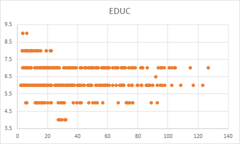
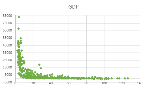
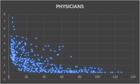
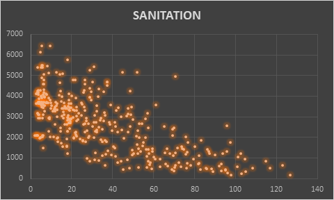
- Produce scatter plots linking infant mortality to each of these potential explanatory factors. Which ones appear to be most strongly correlated with mortality rates?
- The plot of GDP per capita and infant mortality has an unusual feature that complicates our linear modelling techniques. Discuss this feature and its implications for correlation/regression analysis.
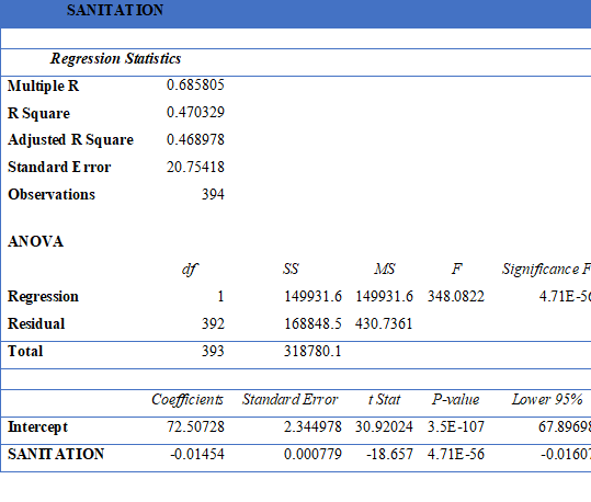
- Regress infant mortality separately against all five covariates (i.e. produce five regressions) and report your results. Which variable is most significantly linked to mortality? (Hint, look at the p-values in your outputs).
- Test the hypothesis that education is significantly correlated with infant mortality. State the hypotheses, test statistic, p-value, critical value, and a conclusion.
- If you are an adviser to the World Health Organization, what types of policies would you recommend, based upon your analysis? Discuss.
Answer
QUESTION 1
About the Dataset
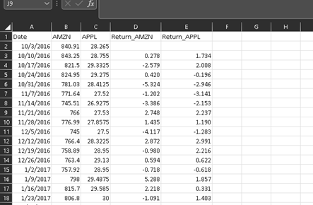
The dataset for Amazon’s and Apple’s share prices on a weekly basis is given in this data analysis assignment. It also contains the details of change in the price of a week. The dataset begins 10th March 2016 to 10th April 2021.
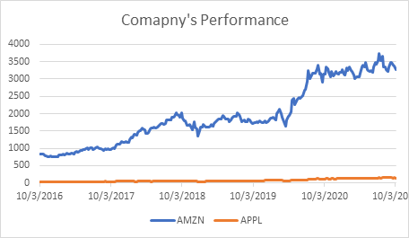
Performance of Both the companies from 2016 to 2020
The line chart below shows both of the company’s performance in last 5 years. It can be directly seen that Apple has witnessed stagnant growth and Amazon has seen more better average growth. Amazon has witnessed tremendous growth in between of March 2020 to early August 2020.
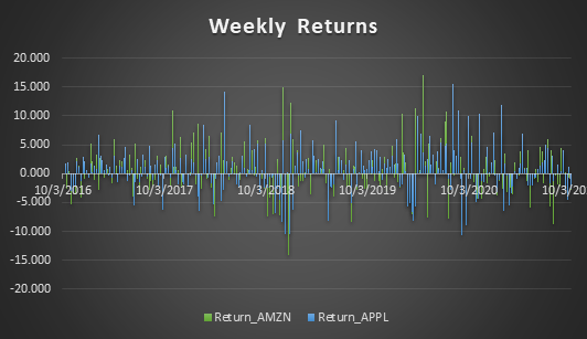
Weekly Returns
The weekly returns of both the companies are given below. The bars of ups and downs is quite prevalent in Apple. So, one could expect greater returns on short term basis with Apple but the risk is high too. With Amazon, the risk of losses is lower and average spikes of growth is comparatively lower in comparison to Apple in a short term.
So, conclusively it can be said that if someone is okay with taking risks, then Apple could have given better returns in short term investment. And for lesser risk and better returns in a long - term investment, Amazon has been better.
Descriptive Analysis of Amazon
Amazon
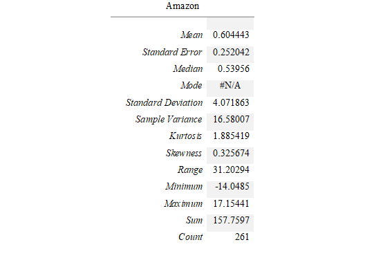
From the table above, the mean of weekly returns is 0.6 which means that company has given an average of 60% return. This means if a person has made the right call, then on average they would have received 60% return.
Descriptive Analysis of Apple
Apple
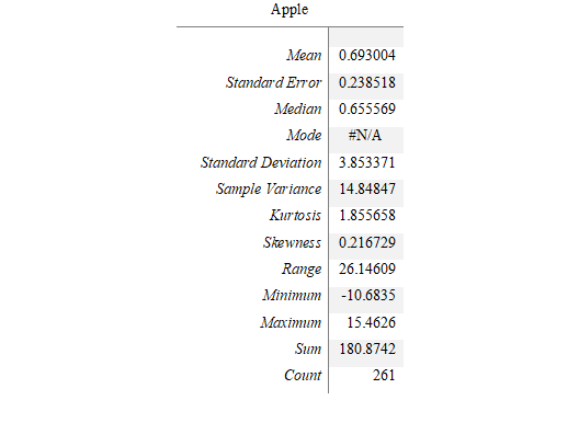
Coefficient of Variation
The coefficient of variation for Amazon is 4.072/0.60 * 100 = 673.655%
The coefficient of variation for Apple is 3.8/0.69 * 100 = 556.039%
Summary
From the coefficient variation, it can be seen that return on trade off is higher for Amazon, though it is quite competitive for Apple too. On the other hand, the risk for return is also higher for Amazon in comparison to Apple. The Apple’s return was less risky since it had lower standard deviation than Amazon.
The Amazon has more skewness than Apple with almost similar kurtosis. This means that both the shares have potential to give a certain level of return on the investment but high skewness of Amazon pertains to more risk as well as return in comparison to Apple. This means that Apple has tendency to provide frequent small gains with lesser risk.
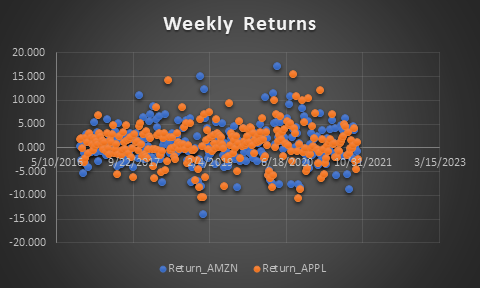
Scatter Plot
From the above scatter plot, it can be said theory 1 is true that says that both are tech companies which have been impact by common market factors in terms of gains and losses both. If theory 2 was to be true, then we would have observed complete reciprocal results. But here the Apple’s weekly return is less scattered and Amazon’s more scattered throughout the duration of five years.
QUESTION 2
About Dataset
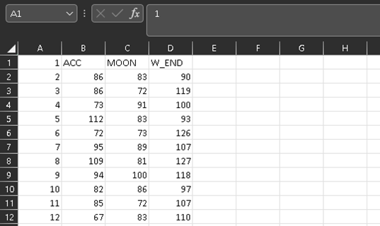
The snap of dataset shows three variables that are ACC – for the number of accidents happening on weekdays, MOON – for the supernatural phenomena, and W_END – for the accidents on weekends.
Basic Interpretation
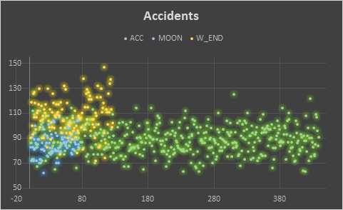
From the scatter plot of the accidents in accordance to all three variable is given below. The first inference is clear that there are a greater number of accidents happening in weekends than in comparison to weekdays. The portion of accidents taking place on any astronomical event is colliding quite much with weekdays accidents but lesser with weekends accidents. This can be inferred that supernatural event or any kind of astronomical event does not necessarily impact accidents. If the argument still exists, then there isn’t sufficient data to show relatedness.
Comparison Between Accidents and Moon Days
From the chart given below, it is quite clear that accidents taking place on astronomical event day almost supersedes on the weekdays but not completely. Apart from that, it has not been observed up to complete extent. This means that it is possible that out of 100 accidents on a particular day, 30 would have been due to supernatural activity but if the day has astronomical event or supernatural activity, then all accidents must have happened due to it which was not the case. Hence, there isn’t sufficient data to prove that accidents happening on weekdays is due to supernatural activity or astronomical event.
From the table below, the above statements can be proved by comparing the value of mean, standard deviation, variance, and kurtosis. The mean is different for both the column and so is standard deviation and variance. In fact, there is large gap in variance depicting the higher and lower possibilities of the accidents due to astronomical activity.
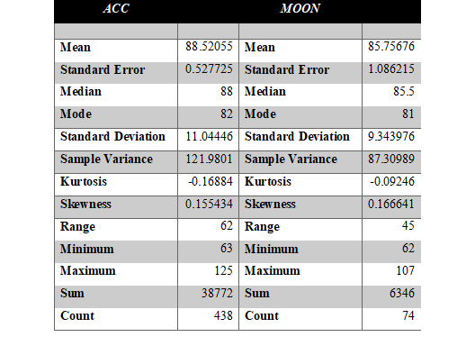
The possibility of large variances or differences among the set of these two variables is comprehensible because weekdays count is quite large in dataset in comparison to Moon days. This means that moon days or days with astronomical event occur quite less in comparison to weekdays count.
So, there is a possibility that with the help of sample variation, there could be a possibility to draw some narrowed results but still it is beyond reach because there is no common parameter among the two columns that forms any kind of relation. So, even if sampling is done for weekdays, the results won’t be accurate, rather it will become more misleading.
Comparison Between Weekdays and Weekends
From the line chart and table below, it is quite clear that the accidents happening on weekends is quite large in number than it happening on weekdays. This is quite obvious because during weekends more people are outside either traveling or doing stuff for leisure and entertainment.
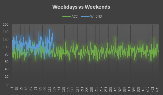
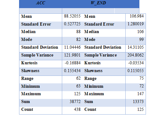
Yes, the results of this section seem to be meaningful and self - explanatory because weekends have more traffic, so there is possibility a greater number of accidents. The mean of accidents on weekend (106.9) is higher than accidents on weekdays (88.5).
QUESTION 3
Confidence Interval
The total number of individuals from a town in the USA is 381.
The number of people who tested positive for results are 88.
Therefore, p^ - 88/381 = 0.231
The standard deviation of the data is 0.422
The standard error, SE=SD/(n)^(1/2 )
SE=0.422/(381)^(1/2 )
SE=0.422/19.5
Thus, standard error is 0.0216
Using these values in Excel sheet of covid.xls
|
Variable |
||||
|
P_Hat |
0.231 |
Standard Error |
0.0216 |
|
|
N |
381 |
Z |
1.65 |
|
|
Alpha |
0.1 |
|||
|
LCL |
UCL |
|||
|
0.195468 |
0.266532 |
From the able above, the confidence interval is (0.19, 0.27)
(i) If the sample size is increased, then the confidence interval will shrink.
(ii) If the confidence interval is changed from 90% to 95%, then confidence interval will expand.
The reason behind the impact of confidence level is the basicity of normality distribution. The distribution of probability is highest for 95% confidence interval and it keeps on decreasing when confidence interval is decreased. So, the graph itself suggests that interval increases with increase in confidence interval. Secondly, with increase in sample size, the values of standard error decreases, thus the interval increases. If the sample size is to be decreased, then standard error value will increase which will increase the confidence interval.
T Test for Age
t-Test: Two-Sample Assuming Unequal Variances
|
t-Test: Two-Sample Assuming Unequal Variances |
||
|
|
||
|
|
Age |
|
|
Mean |
48.49869 |
|
|
Variance |
220.6033 |
|
|
Observations |
381 |
|
|
Hypothesized Mean Difference |
43 |
|
|
df |
380 |
|
|
t Stat |
7.226293 |
|
|
P(T<=t) one-tail |
1.37E-12 |
|
|
t Critical one-tail |
1.648873 |
|
|
P(T<=t) two-tail |
2.74E-12 |
|
|
t Critical two-tail |
1.966226 |
|
The t – Test is carried for age testing for average age to 43. The p – value from the above table can be seen as 1.37E-12 which rejects the null hypothesis. This means that average age is not 43. Our assumption is rejected.
QUESTION 4
Scatter Plots
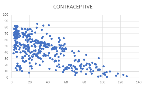
Scatter plot between Mortality Rate and Contraceptive
Scatter plot between Mortality Rate and Education
Scatter plot between Mortality Rate and GDP
Scatter plot between Mortality Rate and Physicians
Scatter plot between Mortality Rate and Sanitation
Among all four scatter plots placed above, the mortality rate has been quite strongly correlated with GDP, number of physicians, and value for sanitation. The country with lower GDP has certain number of mortality rate, but it also implicates that it is not most influencing reason for determining mortality rate. Another parameter Physicians is also a decisive factor. The number of physicians has some level impact on lesser number of mortality rate. The most direct implication of mortality rate among all the five parameters was Sanitation. The level of sanitation is most decisive to implicate mortality rate.
Correlation Analysis and Regression Analysis of Infant Mortality Rate and GDP

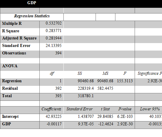
The above table shows the correlation value between GDP and mortality rate. This shows that with increase in GDP, mortality rate is set to decrease. But the extent of correlation is 53%.
SUMMARY OUTPUT
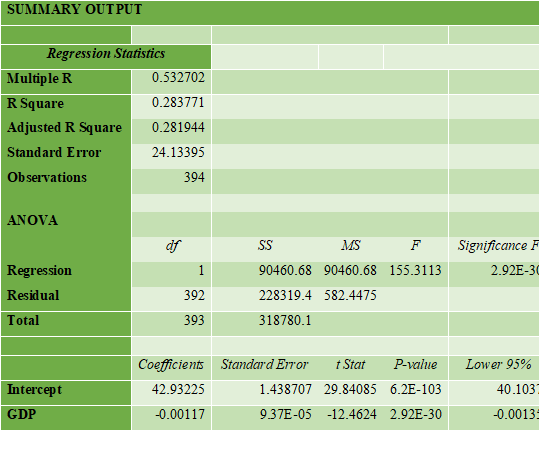
From the above table of regression analysis of GDP and mortality rate. The multiple R value in the output table is the correlation value which has been discussed before and it is 53.27%. The probability of dependency of mortality rate on GDP is 28.3% (R square value) which is quite low. It means being one of the determinants of mortality rate, the GDP is not the mainstream factor. This can be proved by the significance F value which is extremely low tat shows the strength of the model which means that model is right, the probability is low for dependency.
Regression Analysis with all five parameters
EDUCATION
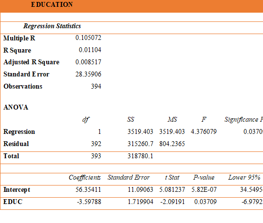
The correlation of education and mortality rate is 10.5% and the probability is 1.1% which is quite low and significance F value is 0.037 which indicates the model being wrong.
GDP
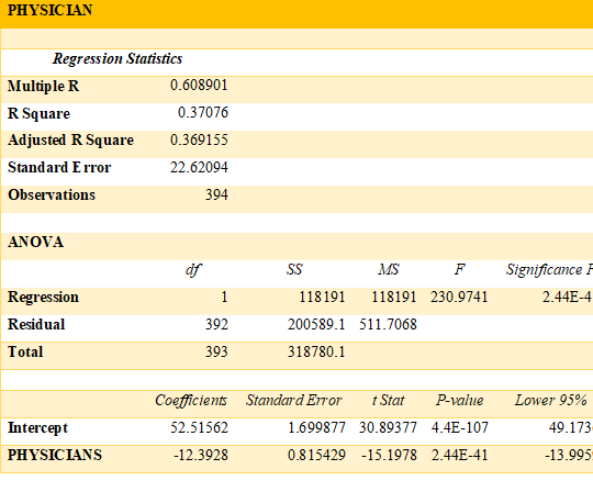
The correlation of physicians and mortality rate is 69.05% and the probability is 47.68% which is quite high to be considered and significance F value is 4.05E-57 which indicates the model completely right.
Summary
Among all the regression analysis, the most sophisticated and accurate results are for contraceptive, physician, and sanitation in the order. This means the biggest reason for higher mortality rate is not using contraceptive which directly implicates that if lesser number of people are born, then there is no likeability of mortality. This can also be interpretated as that if couple are not capable to provide basic needs such as medical facilities and sanitation, then they should use contraceptive. The other parameters are sanitation and availability of physician which is the most prominent parameters on which work is needed to be done. The condition of sanitation will improve the hygiene and health environment for newborns and availability of physicians will assist the kids to remain healthy and fight against diseases.
T – test
The t – test is being carried out between mortality rate and education.
t-Test: Two-Sample Assuming Unequal Variances
The p – value of the test is extremely low which is also less than 0.5. This rejects the hypothesis that there is any correlation between education and mortality rate. This can be verified from the previous section where the correlation value was 10.5%. Thus, the hypothesis is rejected.
Advisory to WHO as per the analysis on data analysis assignment
The data and its results indicate that WHO needs to work in the direction of sanitation and providing medical facilities such as well – trained physicians to the places where it is most needed. They have work to rigorously by targeting the areas where mortality rate is highest. They must implement sanitation and hygiene policies on a large scale to improve the hygiene condition and prevent child mortality.


