Business Intelligence Assignment: Big Data Analytics In Healthcare Industry
Question
Task:
Your task is to use an analytical tool (i.e SAS Visual Analytics) to explore, analyze and visualize the dataset provided.
The aim of this business intelligence assignment is to use the data set allocated to provide interesting insights, trends and patterns amongst the data. Your intended audience is the CEO and middle management of the U.S. Department of Health and Human Services who are responsible for overseeing the health industry in America.
In addition, each individual team member will write a short reflection as part of the report on their individual experience on working on the project.
Answer
Executive Summary
The study herein business intelligence assignment is conducted to analyse and find the usability and applicability of big data analytics and business intelligence in the healthcare industry.The dataset used contains data obtained from hospitals situated in various cities and counties in the US, which is further analysed to draw useful and meaningful insights.These insights can help businesses and economies make effective and quicker decisions. SAS Viya is used for the analysis, interpretation and visualization of the dataset. Many techniques like decision tree, cluster analysis, bar graphs, line charts, etc are used for the same.The significance behind the study falls in the essentiality of quick and better decision making during a healthcare crisis, and ways to tackle it using analysed data. Some of the main findings of the research are as follows:
- A patient’s age is the biggest predictor of the possibility of an individual having heart disease.
- February, January and May showed the greatestno. of patients in hospitals
- There appears to be a steep rise in the number of people admitted who were diagnosed with Chronic Heart Failure during December
- July and August had the least amount of patients and least number of operations
- Hospital number 13 as well as hospital number 35 had the greatestamount of visitors for asthma patients
- Regions 3, 8 and 11 had the highest quantity of patients
- Delray Beach and Miami had the greatestno. of people admittedduring the time period specified initially.
2. Background:
The dataset used for this particular project involvesdataon hospitals across the US from 2011 to June 2012.
Our analysis first focuses on information about the patients. Each and every patient is assigned a unique no. as soon as they are admitted in a hospital, which is given in the file as 142 thousanddistinct values.
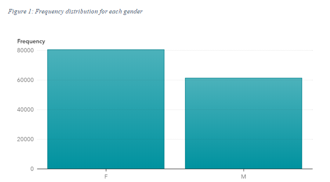
While the total No. of male patients wasabout 62,000, female patients were far more at 80,000. We then look at distribution according to race:
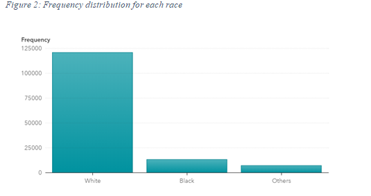
As shown from the above plot, out of the total number of patients admitted, most were white. The average age of all patients admitted during the time period was 74, while the mode and median were 76 years respectively.
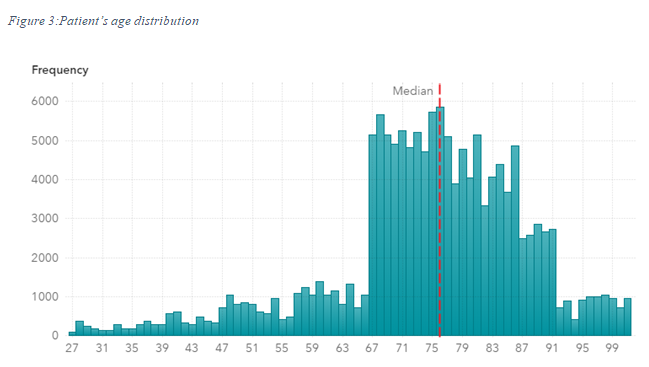
As shown from the above plot, most of the patients admitted happened to be between the age group of 67 to 91.
The dataset is divided into 3 distinct diagnosis groups (CHF, COPD and AMI) whose frequencies can be shown as follows:
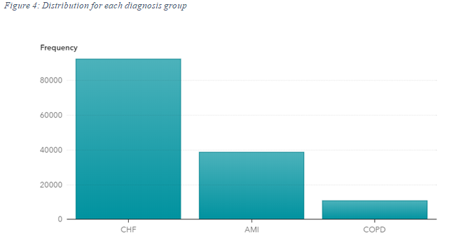
The type of disease and their respective frequencies can be seen in the following manner:
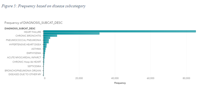
In the above visualization, it is evident that heart failure was the most common cause of admission in all hospitals during the time period specified. Additionally,information on the location of hospitals, counties and regions is also given through X and Y coordinates as well as zip codes.
With the explosion in the transfer and storage of dataset volume, analysing and interpreting such data is becoming more and more important. Big data analytics and business intelligence tools help organisations, firms, businesses, economies analyse humungous amounts of data to draw quick and informative results for effective decision making. It is made up of softwares, techniques and services which transforms raw data into useful insights that lead to efficient and effective decision making (Pratt & Fruhlinger, 2019).
Gone are the days when one needed specialized and skilful analysts to analyse data..BI and big data analytics tools make it extremely easy to do the same for any business without any prior skill or knowledge. This is revolutionary since data is now the most valuable resource in the world. These tools are easy to use, flexible and effective. Business intelligence is a wider term and contains numerous processes and techniques such as Data Mining, Reporting, Performance metrics, Data warehousing and so on (tableau, 2019).
The major advantages of adopting big data analytics techniques are:
- Reduction in Cost: usingthesetechniques significantly diminishes the time it takes to analyse and visualize data. These techniquesensure that costs of business are saved by using techniques like (Insights, 2018).
- Reduction in human errors: Using techniques like machine learning, artificial intelligence, deep learning, etc, errors made by humans are minimized (Kumar, 2018).
- Dynamicinsights and useful information: Data analytics techniquesgiveusefulmeaningful results which ensure proper understanding of business operations and customers.
- Interesting visualizations: These techniquesgive interesting and meaningful visualizations which assist in the explanation of data(James, 2019).
- New products: Big data analytics helps in redeveloping and selling of new products and also gaining insights about the behaviour of customers for existing products (Simplelearn, 2019).
- Better quality: Using techniques like data quality management, businesses ensure high quality of decision(Learntek, 2017).
These techniques help organisation make better and faster decisions, which save costs, time and effort, and thus add on to the revenues of any business (King, 2018).
3. Analysis and Results
The dataobtained for the visualizationcontains information obtained from multiple hospitals all around the USA from September 2011 to June 2012. After completing the visualization, we find the results given below:
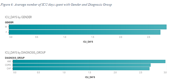
The researchers first plot the meanno. of ICU days spent with gender and diagnosis group of each patient. This shows that the average number of days spent in Icu by male patients was more than that of females.In a similar manner, the mean days spent in ICU for patients in the ‘AMI’ diagnosis group were the highest, as compared to the diagnosis groups of ‘COPD’ and ‘CHF’.
The analysis now shifts towards differences among regions:
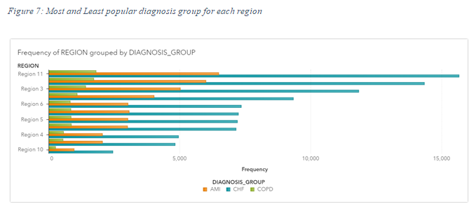
Taking a look at the above chart, we witness that the diagnosis group of COPD was the least common in all regions, whereas the diagnosis group of ‘CHF’ was the most common. Thus, during the time period of September 2011 to June 2012, it is evident that most of the patients belonged to the ‘CHF’ diagnosis group.
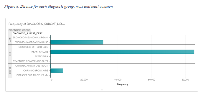
The above plot evidently shows the most and least common disease in each diagnosis group. We find that Pneumonia Organism UNSP is the most common form of disease in the ‘AMI’ diagnosis group with 31,245 patients, whereas Bronchopneumonia is the least common disease with only 94 patients in the same. Similarly, Heart failure is the most common disease in the diagnosis group of ‘CHF’ with 85,138 patients, and disorders of fluid electricity is the least common with only 94 patients. Finally, Chronic bronchitis is the most common disease in ‘COPD’.
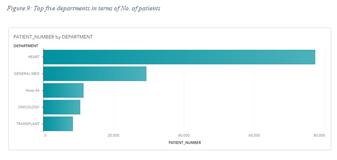
The next analysisentailsuseful information on the top 5 departments in terms of No. of patients admitted, which can be shown from the above plot. It is evident that the department concerningdiseases related to heart had the mostNo. of patients.
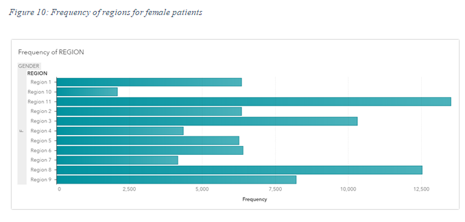
The above plot evidently shows that region 11, region 8, region 3had the highest No. of female patients.
We now focus our attention towards the places that each patient was discharged to, which can be shown as follows:
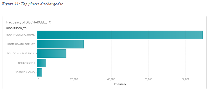
it shows the top 5 places patients were discharged to. It is evident that Routine home discharge was the most common, followed by home health agency.
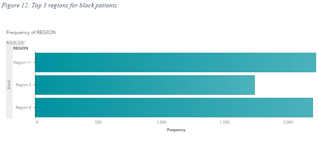
The plot above distinctly shows the top 3 regions for patients which were black by race. These 3 regions are region 11, region 3 and region 8.
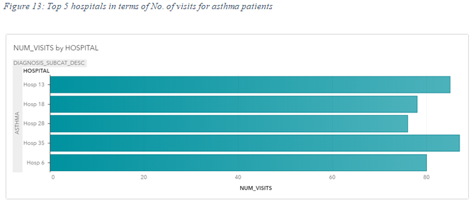
The data entailsvalues on the no. of visits for each patient in every hospital. From the plot above, it is evident that the top 5 hospital in terms of the No. of visits for asthma patients, which were hospital 12, hospital 18, hospital 28, hospital 35 and hospital 6.
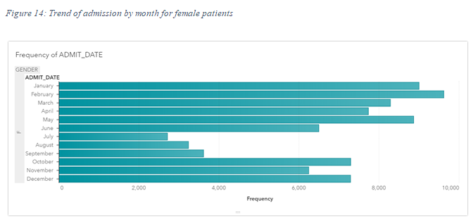
The above plot shows the frequency of admit months for female patients only. It is evident that January February and May had the highest No. of male patient admits, whereas July and August were the lowest.
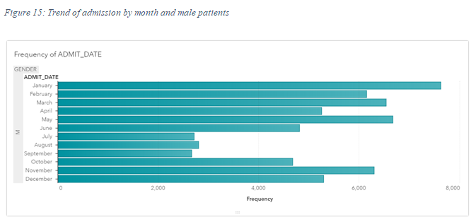
For male patients, January, may and march entailed the highest No. of patients, whereas July August and September had the lowest.
The next task focuses on finding the average number of days spent in hospital, which is calculated by using the “treat as” function in SAS to treat dates as numbers, and returns the difference between date dispatched and date admitted in numeric form.
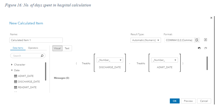
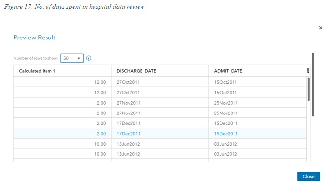
The first column gives us the total No. of days spent in the hospital. We then find the average and plot it against the desired variable.
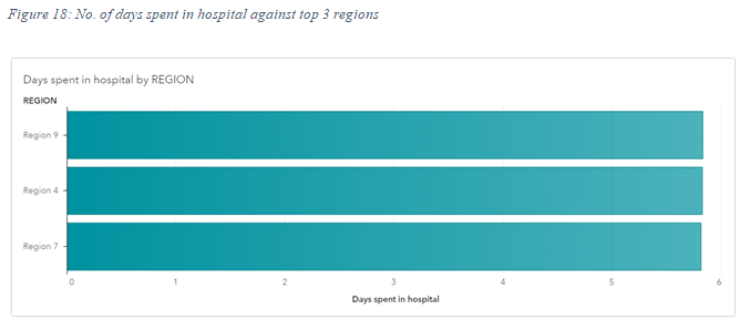
The above plot gives us the top 3 regions with respect to the meanNo. of days spent in the hospital.
To check for differences among cities, we plot the following plot:
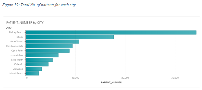
It is evident that most of the patients were from Delray beach, followed by Miami. This plot gives us the top 10 cities in terms of No. of patients admitted.
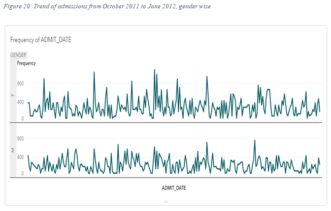
We now take a look at the trend of admission dates for both genders, which can be seen from the above plot between October 2011 and June 2012.
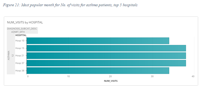
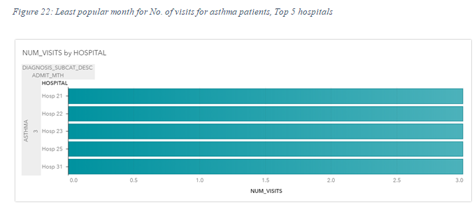
It is evident that December is the most common month for No. of visits for asthma patients, while march is the least common month.
The researchers now emphasize on the trend of patient numbers diagnosed with the group of ‘CHF’ or chronic heart failure. It is evident such trend as follows:
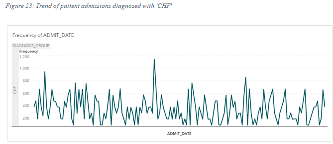
Trend analysis is useful for finding seasonality in the dataset.
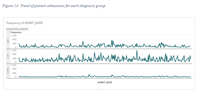
From the above plot, it is evident that the trend of diagnosis groups of AMI, CHF and COPD respectively. It is evident that CHF has the highest volatility, while the trend of COPD is relatively stagnant and stable.
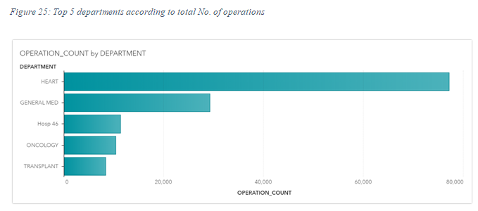
We now have a look at the major 5 departments in terms of operation count. It is evident thatthe department which deals with heart diseasesentails the highest No. of operations in all hospitals, followed by General med. To see how these operations,change over time, we look at the following plot:
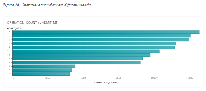
From the above two plots, it is evident that February, January and May had the highest No. of operation counts, whereas July had the lowest.
In the next task, we create a decision tree model to predict whether an individual would have chronic heart disease or not. We us the variable ‘ICD9 Target’ as the target variable and Gender, race and Patient’s age as the predictors.
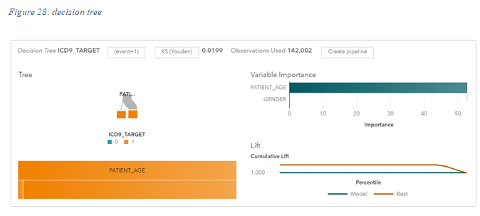
We find that a patient’s age is the most important predictor of whether an individual will have heart disease or not. Race is also a significant predictor, but not as much as Patient’s age.
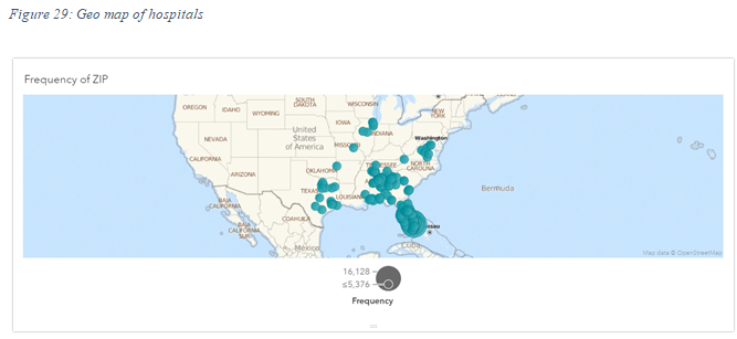
The above GEO map plots the hospitals across united states which are used for this study.
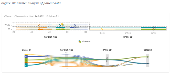
Finally, we create a cluster model on information about patients like gender, race and age, which can be shown as follows:
Additional Visualizations:
In addition to these tasks, we have other additional visualizations, which can be seen as follows:
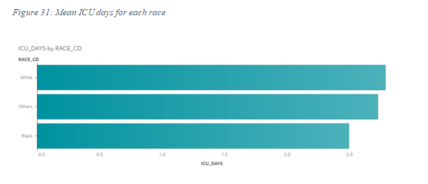
This above visualization was chosen to find the differences among various races. The above plot shows the meanno. of days spent in ICU for each race. It is evident thatpatients who were white had the highest No. of ICU days, while the least was of black patients.
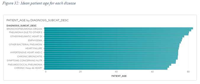
The above plot was chosen to determine the average age at which each disease takes place. We look at the mean age of patient under each disease. We find the Bronchopneumonia had the highest mean patient age of 85+, while chronic heart failure had the lowest.
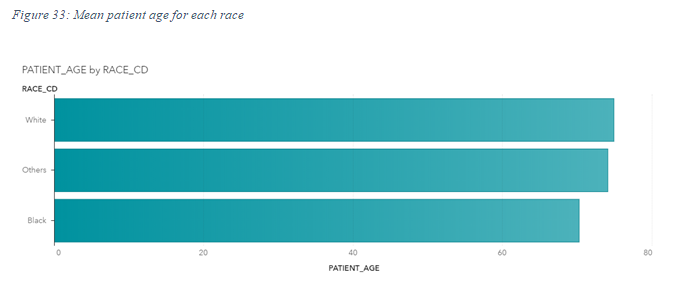
The above graph was chosen to have a demographic insight about the patients admitted in the hospitals. Finally, we look at the mean patient age with each race.
4. Discussion of Results
After a detailed investigation and visualization of the health care valuesgiven or obtained from hospitals throughout the US, many meaningful insights are drawn which can assist in quick and better decision making. We first found the variances in meanNo. of days spent in ICU for each gender, race and diagnosis group. Male patients, on an average spent more number of days in ICU than female patients. Similarly, patients diagnosed with AMI, on an average, spent more time or days in ICU. Finally, patients who were white spent more time in ICU on average.
Chronic heart failure was the most common diagnosis group across all regions, whereas COPD was the least common. Moreover, heart failure was the most popular disease in the diagnosis group of CHF. This shows that diseases and conditions related to heart were the most common among all regions and counties.
The top 5 departments which had the most No. of patients in the time period were Heart, general med, oncology, transplant and Hosp 46. Again here, heart department tends to have the highest number of patients, which shows the prevalence of the disease in the country. Region number 3, 11 and 8 had the greatest number of female patients to be admitted in hospitals. These regions also had the highest No. of African American patients. Thus, these 3 regions account for most of the cases admitted, which should be checked.
Looking at the meanNo. of hospital visits for asthma patients, we see that Hospital number 13 and Hospital number 35 had the largestnumber of visits. January, February and May had the highest number of female patients. The cause of the rise in the number of cases in these months should be investigated upon.
Out of all the patients admitted during the time period, more than 60% of the patients were from Delray Beach, followed by Miami. These places need to be checked to find the cause of such a sharp rise in the cases in such places. The most popular month for asthma patients’ averageNo. of visits was December, whereas the least popular month was March. Looking at the trend of CHF diagnosed patients, it is visible thatthere was abig rise in the month of December. Thus, December seems to have the highest number of cases. COPD and Ami trends are relatively stagnant and less volatile than that of CHF. The department concerned with heart diseases had the greatest No. of operations out of all departments, followed by General medicine and Oncology.
Most of the patients were discharged to home in a routine manner, while some were discharged to health agencies.
Similarly, February, January and May had the greatest No. of operations done, while July and August had the least. A patient’s age significantly determines the chances of an individual suffering from heart disease, followed by race. The older a patient is, the more likely they are to face chances of heart failure.
February was the most common month for admission of male of male patients, whereas January was the most common for female patients. After calculating the number of days spent by each patient, regions 9, 4 and 7 had patients with a higher number of days spent in hospitals.
February had the highest number of operation counts, followed by January and December. The trend for the admission of female patients showed much more volatility than those of male patients.
The trend for patients diagnosed with CHF or chronic heart failure tends to show a sharp rise in the month of December.
5. Conclusion
After going through the above report on a detailed study on the healthcare sector, we conclude and findinnumerablemeaningful and concrete insights which can assist policy makers make effective and quick decisions. The essentiality of these decisions has increased significantly, with such an unstable environment. The insights gathered from the above research can help policy makers adopt these technologies and make decisions in a field which could potentially save lives.
6. Recommendations:
In light of the above findings, we make the following suggestions:
- A greater amount of allocation is required for research in development towards tackling heart diseases, since CHF and Heart failure were extremely common.
- Most of the patients admitted originated from Delray Beach and Miami. The reason behind such rise in cases need to be determined.
- Similarly, investigations need to be placed for regions 3, 8 and 11 since they had the highest number of patients, female and black.
- Hospitals number 13 and hospital number 35 had the highest No. of visits for asthma patients. Due to the increased traffic, better operations need to be set up so that these visits do not hinder the workings of the hospital.
- January, February and may had the greatest No. of hospital admissions. An investigation needs to be conducted to find out the reason behind the same and whether its coincidental or seasonal.
7. References
Bhattar, P. (2019). Energy: Intelligence and Efficiency. Retrieved from Wartsila.com: https://www.wartsila.com/twentyfour7/energy/5-trends-that-will-shape-the-energy-sector-in-2020
Insights, V. (2018, April 17). 10 Advantages of Data-Visualization. Retrieved from Visualr: https://visualrsoftware.com/advantages-data-visualization/
James, L. (2019). Big Data Analytics: The need for pragmatism, tangible benefits and real-world case studies. Retrieved from Yellowfin.com: https://www.yellowfinbi.com/blog/2014/06/yfcommunitynews-big-data-analytics-the-need-for-pragmatism-tangible-benefits-and-real-world-case-165305
King, A. (2018, May 4). 7 Benefits to Using Big Data for Small Businesses. Retrieved from Industriuscfo.com: http://www.industriuscfo.com/7-benefits-using-big-data/
Kumar, S. (2018). Advantages and Disadvantages of Artificial Intelligence. Retrieved from towardsdatascience: https://towardsdatascience.com/advantages-and-disadvantages-of-artificial-intelligence-182a5ef6588c
Learntek. (2017, January 17). What are the advantages of BIG DATA Analytics, and how will it impact the future. Business intelligence assignment Retrieved from Learntek.com: https://www.learntek.org/blog/advantages-big-data-analytics/
Pratt, M., & Fruhlinger, J. (2019, October 16). What is business intelligence? Transforming data into business insights. Retrieved from Cio.com: https://www.cio.com/article/2439504/business-intelligence-definition-and-solutions.html
SAS. (2018). What is Big Data Analytics and Why it Matters. Retrieved from Sas.com: https://www.sas.com/en_in/insights/analytics/big-data-analytics.html
Simplelearn. (2019). Big Data. Retrieved from Simplelearn.com: https://www.simplilearn.com/tutorials/big-data-tutorial/what-is-big-data
tableau. (2019, February 5). What is business intelligence? Your guide to BI and why it matters. Retrieved from tableau: https://www.tableau.com/learn/articles/business-intelligence
Verma, A. (2018, March 19). Why is Big Data Analytics So Important? Retrieved from Whizlabs.com: https://www.whizlabs.com/blog/big-data-analytics-importance/


